


a much needed refresh
new colors, new fonts, new logo

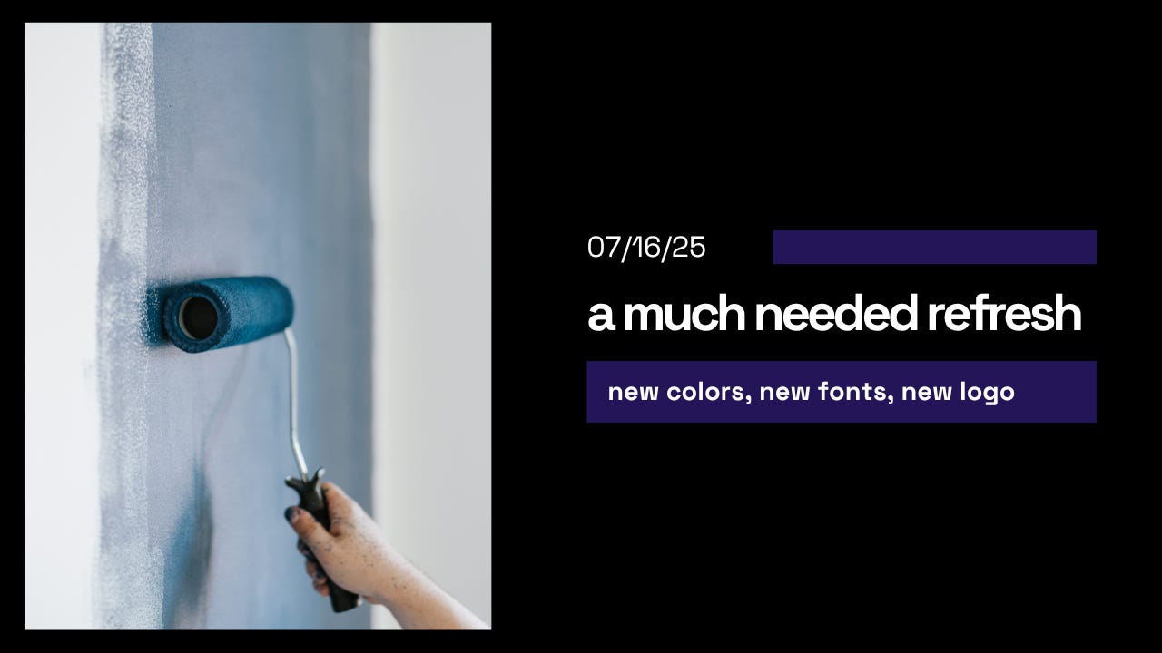
Over the last few months, I started to get tired of my “branding”. It’s been a while since I updated the look and feel of my substack so I decided that now is the time.
Introducing some new stuff:


The aesthetic draws from brutalist design principles - think raw concrete buildings, but applied to digital spaces. There's no softening, no gradients, no decorative flourishes. Just stark black backgrounds, crisp white text, and that distinctive purple block that acts like a digital stamp of identity.
Titles and subtitles are not capitalized. This is a trend I am seeing elsewhere and I like it.
Negative space signals confidence and quality. It says "I can afford to use space inefficiently because my message is that strong." Think Apple ads or most recently the new Polestar EVs.
The typography (Space Grotesk) has a technical, almost monospace feel without actually being monospace. It's the kind of font you'd expect to see in a your terminal or a SaaS dashboard - clean, geometric, and unapologetically functional. I love it.
I doubt anyone will read this or care. But hey, I may as well point it out!
And yes I am cosplaying as a web designer.
Cheers,
Joe